Choosing the right typography can make or break your design. With thousands of Google Fonts available, having a reliable font preview tool is essential for designers and developers to test fonts with real content before implementation.
In this comprehensive guide, we'll explore how to effectively preview and test Google Fonts online, compare different typefaces, and make informed typography decisions for your web projects.
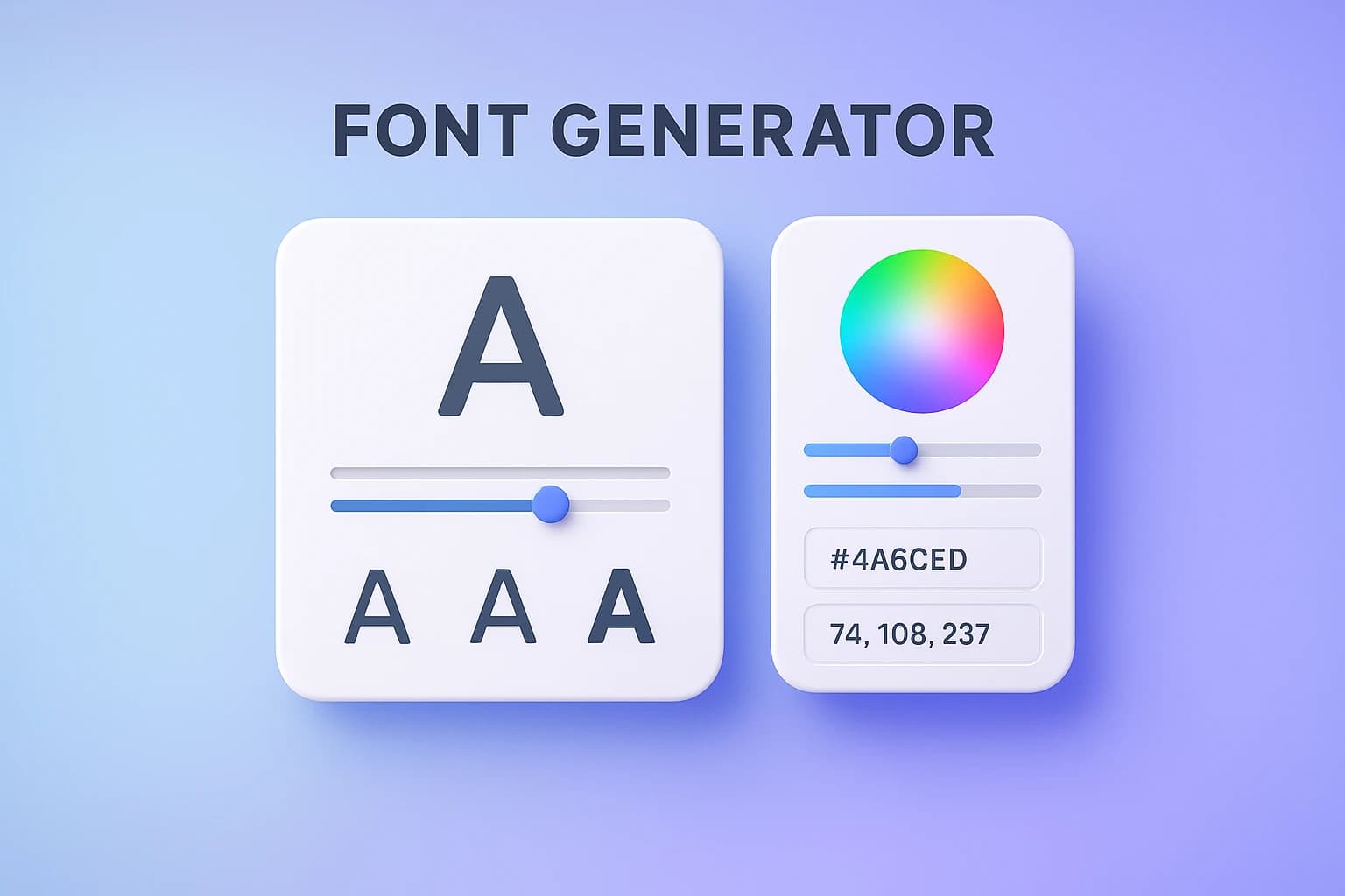
Preview Google Fonts with custom text, sizes, weights, and styling options in real-time.
What is a Font Preview Tool?
A font preview tool is an interactive typography playground that allows you to test Google Fonts with your own text, customize styling options, and see exactly how fonts will look in your project. It's essential for:
Web Designers: Visualizing how fonts will appear in website layouts and interfaces
Developers: Testing font performance and readability before adding to CSS
Graphic Designers: Comparing multiple typefaces for branding and marketing materials
Content Creators: Ensuring text readability across different devices and screen sizes
Key Features of Our Font Preview Tool
Custom Text Preview
Type your own text to see exactly how fonts will look with your actual content. Perfect for headlines, body text, or any custom messaging.
Font Size Adjustment
Test fonts from 12px to 120px to ensure readability at all sizes. See how typefaces perform for both large headings and small body text.
Weight & Style Options
Explore different font weights (light, regular, medium, bold, black) and styles (normal, italic) to find the perfect variation.
Real-time CSS Code
Copy ready-to-use CSS code including Google Fonts import link and font-family declaration. Save time with instant implementation.
Letter Spacing & Line Height
Fine-tune typography with adjustable letter spacing (tracking) and line height (leading) for optimal readability and aesthetics.
Why Preview Google Fonts Before Using Them?
Visual Accuracy
See exactly how fonts will look with your content before committing to implementation.
Save Development Time
Test multiple fonts quickly without writing code or importing unnecessary font files.
Better Typography Decisions
Compare fonts side-by-side and make informed choices based on readability and aesthetics.
Instant CSS Code
Get production-ready CSS code with proper Google Fonts imports and declarations.
How to Use the Font Preview Tool (Step-by-Step)
Open the Font Preview Tool
Go to ImageConvertors Font Preview to access the typography playground.
Select a Google Font
Browse through thousands of Google Fonts and select one from the dropdown menu.
Enter Your Custom Text
Type your own text to see how the font looks with your actual content. Test headlines, paragraphs, or any custom messaging.
Customize Styling Options
Adjust font size, weight, style, letter spacing, and line height to perfect your typography.
Copy CSS Code
Click the copy button to get ready-to-use CSS code including Google Fonts import and font-family declaration.
Implement in Your Project
Paste the CSS code into your stylesheet or HTML head section and start using your chosen font.
Pro Tips for Choosing the Perfect Font
Test with real content: Use actual text from your project instead of lorem ipsum to see how the font performs in context.
Check multiple sizes: Test fonts at different sizes - what looks great at 48px might be unreadable at 14px.
Consider readability: Prioritize legibility over style, especially for body text. Decorative fonts work best for headlines.
Limit font families: Use 2-3 font families maximum per project to maintain visual consistency and performance.
Test on multiple devices: Fonts may appear differently on various screens, browsers, and operating systems.
Check font weights availability: Not all Google Fonts offer the same weight variations. Ensure your chosen font has the weights you need.
Typography Best Practices
For Body Text
- •Use font sizes between 16-18px for comfortable reading
- •Set line height to 1.5-1.6 for optimal readability
- •Choose fonts with clear letterforms and good x-height
- •Prefer regular or medium weights for body text
For Headlines
- •Experiment with bold, distinctive typefaces that grab attention
- •Use larger sizes (32-72px) to create visual hierarchy
- •Consider tighter letter spacing for large headlines
- •Choose fonts that complement your brand personality
Common FAQs
Q: How do I add Google Fonts to my website?
A: After choosing a font in our preview tool, copy the provided CSS code. Add the @import line to your stylesheet or the <link> tag to your HTML head section. Then use the font-family property in your CSS.
Q: Are Google Fonts free for commercial use?
A: Yes! All Google Fonts are open source and free to use for both personal and commercial projects without any restrictions or attribution requirements.
Q: Will using Google Fonts slow down my website?
A: Google Fonts are optimized for web performance and served from fast CDNs. To minimize impact, only load the font weights and styles you actually use, and consider using font-display: swap in your CSS.
Q: Can I preview multiple fonts at once?
A: While our preview tool focuses on one font at a time for detailed testing, you can quickly switch between fonts to compare them. For pre-made font combinations, check our Font Pairings tool.
Q: What's the difference between serif and sans-serif fonts?
A: Serif fonts have decorative strokes (serifs) at the end of letters, giving a traditional feel (e.g., Times New Roman). Sans-serif fonts lack these strokes, appearing more modern and clean (e.g., Arial). Sans-serif fonts generally work better for digital screens.