Creating consistent and harmonious typography is essential for professional web design. A typographic scale provides a systematic approach to font sizing, ensuring visual hierarchy and readability across your entire design system.
In this comprehensive guide, we'll explore what typographic scales are, how musical ratios create harmony in design, and how to generate and implement perfect font size scales for your projects.
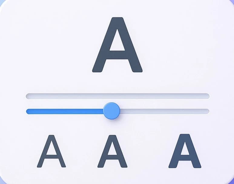
Generate harmonious font size scales using mathematical ratios and export CSS custom properties.
What is a Typographic Scale?
A typographic scale (also called a modular scale or type scale) is a sequence of font sizes based on a mathematical ratio. Instead of randomly choosing font sizes like 14px, 18px, 24px, 32px, a typographic scale uses consistent mathematical relationships to create harmony and visual rhythm.
Visual Hierarchy: Clear distinction between heading levels and body text
Consistency: Predictable sizing across your entire design system
Mathematical Harmony: Sizes that feel naturally balanced and pleasing
Easy Maintenance: Systematic approach makes design decisions faster and updates easier
Understanding Musical Ratios in Typography
Typographic scales are based on musical ratios - the same mathematical relationships that create harmony in music also create visual harmony in typography. Here are the most popular ratios:
Minor Second (1.067)
SubtleSmallest ratio, creates subtle differences between sizes. Best for minimalist designs or when you need many size steps close together.
Example: 16px → 17px → 18px → 19px
Major Second (1.125)
BalancedConservative scale with noticeable but gentle progression. Great for text-heavy sites and professional applications.
Example: 16px → 18px → 20px → 23px
Minor Third (1.2)
PopularOne of the most versatile ratios. Creates clear hierarchy without being too dramatic. Works well for most web projects.
Example: 16px → 19px → 23px → 28px
Major Third (1.25)
RecommendedPerfect for modern web design. Creates strong but not overwhelming hierarchy. Excellent for marketing sites and portfolios.
Example: 16px → 20px → 25px → 31px
Perfect Fourth (1.333)
BoldCreates strong visual contrast. Great for designs that need dramatic hierarchy and impact. Popular for landing pages.
Example: 16px → 21px → 28px → 38px
Golden Ratio (1.618)
ClassicBased on the mathematical golden ratio found in nature. Creates dramatic size differences. Best for designs with fewer hierarchy levels.
Example: 16px → 26px → 42px → 68px
Why Use a Typographic Scale?
Professional Results
Create polished, professional designs with mathematically harmonious typography.
Faster Decisions
No more guessing font sizes. Your scale provides predetermined, harmonious options.
Consistent UI
Maintain consistency across pages, components, and team members.
Easy Implementation
Export as CSS custom properties and use throughout your entire project.
How to Generate Your Typographic Scale (Step-by-Step)
Open the Scale Generator
Go to ImageConvertors Typographic Scale to access the generator tool.
Set Your Base Font Size
Choose your base font size (typically 16px for body text). All other sizes will be calculated from this base.
Choose a Ratio
Select a musical ratio. Try Major Third (1.25) or Perfect Fourth (1.333) for most projects.
Preview the Scale
See your complete font size scale visualized with sample text at each size level.
Export CSS Variables
Copy the generated CSS custom properties to use throughout your project for consistent sizing.
Implement in Your Design
Add the CSS to your stylesheet and reference the variables throughout your components and pages.
CSS Implementation Example
:root {
  /* Base size */
  --font-size-base: 16px;

  /* Scale using Major Third (1.25) */
  --font-size-xs: 10px;
  --font-size-sm: 13px;
  --font-size-base: 16px;
  --font-size-md: 20px;
  --font-size-lg: 25px;
  --font-size-xl: 31px;
  --font-size-2xl: 39px;
  --font-size-3xl: 49px;
  --font-size-4xl: 61px;
}

/* Usage in your CSS */
body {
  font-size: var(--font-size-base);
}

h1 {
  font-size: var(--font-size-4xl);
}

h2 {
  font-size: var(--font-size-3xl);
}

h3 {
  font-size: var(--font-size-2xl);
}

.small-text {
  font-size: var(--font-size-sm);
}
Using CSS custom properties makes it easy to maintain consistency and update your scale globally if needed.
Pro Tips for Using Typographic Scales
Start with 16px base: This is the web standard and provides good readability for most users.
You don't need every size: Generate a full scale but only use the sizes you need. Skip steps if needed.
Responsive adjustments: Consider using a smaller ratio on mobile devices where space is limited.
Document your system: Keep a style guide showing which scale level to use for each element type.
Test with real content: Preview your scale with actual content to ensure it works in context.
Combine with line height: Use proportional line heights (e.g., 1.5 for body, 1.2 for headings) for optimal readability.
Common FAQs
Q: What's the best ratio for web design?
A: The Major Third (1.25) and Perfect Fourth (1.333) ratios are most popular for web design. Major Third creates clear but not overwhelming hierarchy, while Perfect Fourth provides more dramatic contrast. Start with Major Third and adjust based on your needs.
Q: Should I use pixels or rem units?
A: Rem units are generally better for accessibility as they respect user browser settings. However, the scale principles work the same regardless of units. You can generate in pixels and convert to rem by dividing by 16 (e.g., 20px = 1.25rem).
Q: Can I modify individual sizes in my scale?
A: While you can make adjustments, doing so defeats the purpose of a systematic scale. If sizes don't work, try a different ratio or base size instead of manual adjustments.
Q: How many size steps should I generate?
A: Generate 8-10 steps (from extra small to extra large). This gives you flexibility while maintaining consistency. You don't have to use every step - pick the ones that work for your design.